
Table of Contents
One of the best ways to kick off learning about a subject, in particular, is to scavenge the internet for relevant information over the internet. The web is getting more and more crowded with literally dozens of information being added making it tough for anyone to get noticed among the masses.
I will start, as I always do, with a brief explanation of what are Micro-interactions and how they work so we’re all on the same page.
Define Micro Interactions
If simply put, micro-interactions are nothing more than the small yet effective, functional and interactive details of a product. Created with a single purpose, micro-interactions can be found all over your device and within apps. The main objective is to delight the end-user; to create a moment that is engaging, welcoming and of course the most important of all- it has to be human-friendly. One of the premium example used to explain micro-interaction is this:
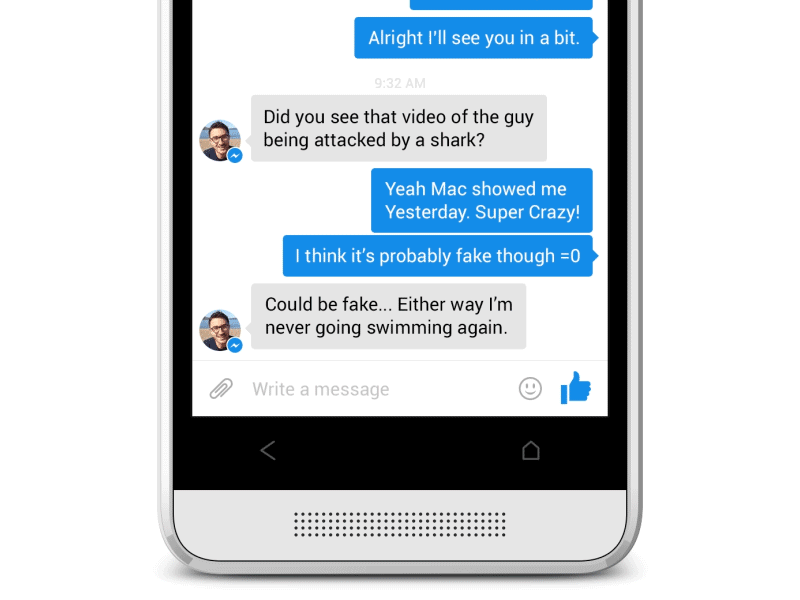
Now why this example is the best?
- It brings the best of both worlds.
- Effective communication with relevant feedback on time
- Enhancing the sense of direct manipulation
- Helping people to see the result of their actions
Speaking further regarding the same, micro-interactions play a vital role in enhancing our digital lives; whether you are fortunate enough to notice or not notice them. To buy a product online from creating an account into a mobile application; micro-interactions are the fine details that make our lives easier.
Significance of Micro Interactions
Now there are times while creating a product we often tend to forget what our main goal is; to change the human behavior. Digital products are meant to ease our day to day lives and not mess it up. The attention to detail is the key to making these moments almost smooth and invisible to the user in the details. Sit back and think for a while how people work with and use their devices.
Another crucial aspect to take into account is an enjoyable experience means more than just usability. Something that has to be engaging, and that’s where the term plays its trump card.
On and all, micro-interactions can enhance a product’s user experience by:
- Encouraging engagement
- Displaying system status
- Providing error prevention
- Communicating brand
Further below I would like you to get acquainted with certain reasons stating the true importance of micro-interactions
- Improve website navigation
- Provide instant and relevant feedback whether an action is completed or not to the end-user
- Give additional tips to the end-user
- Makes user experience much more rewarding
- Encourage sharing, liking, and commenting on your content
- Direct users’ attention
- And, finally, they just make your site more emotional
The micro-interactions model
A few years ago back in 2014, Dan Saffer published the book Microinteractions. Here he first coined the term and outlined a model for designing them. The model comprised of four crucial aspects such as:
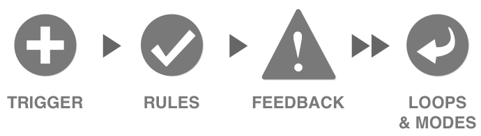
Triggers- As the name implies, triggers initiate a micro-interaction. Triggers can be further bifurcated into two categories.
- User-initiated triggers- A user action initiates a micro-interaction. In simple words, when a user clicks a button or says something to a voice-activated system. For example, an iPhone user says hi Siri where as an Android chooses Google Assistant.
- System initiated triggers- It may quite interest you to know that the system can trigger the action when some specific usually predetermined conditions have been met. For instance, if an email app automatically checks a user's inbox for changes and notifies the user of new mail.
Rules- As I said before a trigger initiates a sequence of events often known as rules. Rules are the ones defining the actual actions that happen in response to changed conditions. More specifically, rules should make the end-users flow through the interaction part flawlessly. This includes several aspects such as:
- Determining what actions most people often take
- Building them in as smart defaults
Rules can even prevent human errors by simply blocking actions that might break the micro-interaction sooner or later. For example, it may quite interest you to know that Gmail is ill-framed for catching an email especially before it goes out without an attachment. What I mean is if something like, “I’ve attached…” is written in the body.
Feedback- I am sure you must be knowing what feedback is. But here the term feedback means anything a user sees, hears or feels while a micro-interaction is something that exactly happens in feedback. In micro-interactions, the less the feedback, the better.
Also, here is a place where one can add a decorative layer to your micro-interaction. At times, when situations are irritating, such as error messages or loading time is high; a little bit of humor works quite well.
Loops and Modes- Last but certainly not the least, this determines the meta-rules of the micro-interaction. In case, if any condition changes what might happen to the micro-interaction? However, it is said that modes should be avoided in micro-interactions unless they are extremely important. On the other hand, loops exactly determine the duration of these interactions. For example, how long will this micro-interaction last? Will they end up immediately or will it repeat forever? Loops can help extend your micro-interaction into the future, including what happens when the user returns with your micro-interaction for the second time, or the tenth, or the hundredth time.
Time to get Micro Interacting
Apart from being one of the hottest UX trends right now, micro-interaction design to the next level. Like it or not, this factor, in particular, is a fundamental part of any website design, without them any site would seem boring and bland. Micro-interactions are those magical creatures that can delight, create surprise and offer something more entertaining as well as engaging. Further below I would like to mention certain micro-interactions who have nailed in terms of user experience!
Swipe- This action is used to eliminate tapping and is much more interactive and smooth. It helps the user quickly switch between the tabs and acquire more information regarding the product. It may also interest you to know that swiping is a very common gesture and guides the users subconsciously without making them think; just like we have been reading ‘Don’t make your users think’. What more? It’s insanely fun and addictive.
Animations- Animation simply enables and improves micro-interactions. They indeed personify good design. However, their presence might not be noticed but absence does take a toll on everyone. More importantly, they act like a glue aiding designer while making the simplest of processes interesting as well as addictive. But one must also keep this in mind, they are meant to engage the end-users and not distract or frustrate them. If there is any case of delaying the process or introducing a new style on the website might cause some confusion.
Data input- I am pretty sure we all have been through the frustration of setting up a password or creating an account. This behavior can easily raise hackles. However, proactive suggestions on password strength and usage make it way easier for a user to proceed ahead, some interactive interactions at the time of data input also keep users engaged with the process and help accomplish the goal.
Making things interesting- There is no denying in the fact that it is very crucial to keep your end-users well-informed regarding what’s exactly happening on a site or app. In case by any chance, users are not informed they might get annoyed and eventually end up closing your site or app. With the help of micro-interactions, a user can know exactly what is going on and how long it might take to get things resolved. Even failure messages can be humorous yet effective to retain the trust of the user.
Call to Action- In general, here micro-interactions nudges the user to interact with an application or website. Call to action instills a feeling of achievement and also empathy factor in user behavior. And can you say which is the best way to make your end-user interact well? It’s with appropriate CTA to entice the interest of the user.
Tips to consider while designing micro-interactions
- Always put yourself in the user’s shoes and use all that you have to figure out how they use your app.
- Animations should be best in terms of aesthetics so that they can enhance the user experience.
- One must understand how would the end-user feel while using the app, and more specifically this should be the sole reason for anyone to use your app. Annoying them could be a major turn-off and the reason why they switched to your competitors.
- Making use of non-technical or human language is a must. Imagine how a funny and iconic copy can make you forget for a moment how frustrating it might be a blank page within an app.
- As a web designer, it is vital to keep your ego aside and get the real work done. Be patient and see what works and what doesn’t, where to trim the fat and where to get your ego out of the way leading to unforgettable user experience.
- Make sure your micro-interaction occurs as a single unified movement. In case, if your design contains several actions occurring at different places- stop doing it then and there.
- The animation won’t save you each time. It is very crucial for your design to make sense before you try to pimp it with animation.
- Lastly, as a web designer, most of the time we aren’t used to designing 300 – 400-millisecond animations at a time. And that’s the reason why we easily lose control and stop seeing them as what they are. I am talking about golden opportunities.
Tools to use while designing
Down below I would like to mention certain tools (the effective ones) that can assist you well in designing these elements
If you are familiar with coding:-
- Mobile: Xcode, Android studio
- Mobile or Web: Framer
- Web: CSS animation
When designing an interaction between a screen-like push and a module:
- Invision and Marvel
When creating more detailed interactions
- Principle, Adobe CC, origami Studio and Protopie
Lastly, when creating detailed interactions + animation
- After Effects
Whether you wish to accomplish a single task or manage any outgoing task, pair devices together, interact well with a single piece of data, control any ongoing process, adjust settings, create or view any piece of content; micro-interactions are all you have to use.
Best Micro-interactions examples to consider
Here are some relevant examples of services that implemented micro-interactions in a truly effective way nowadays:
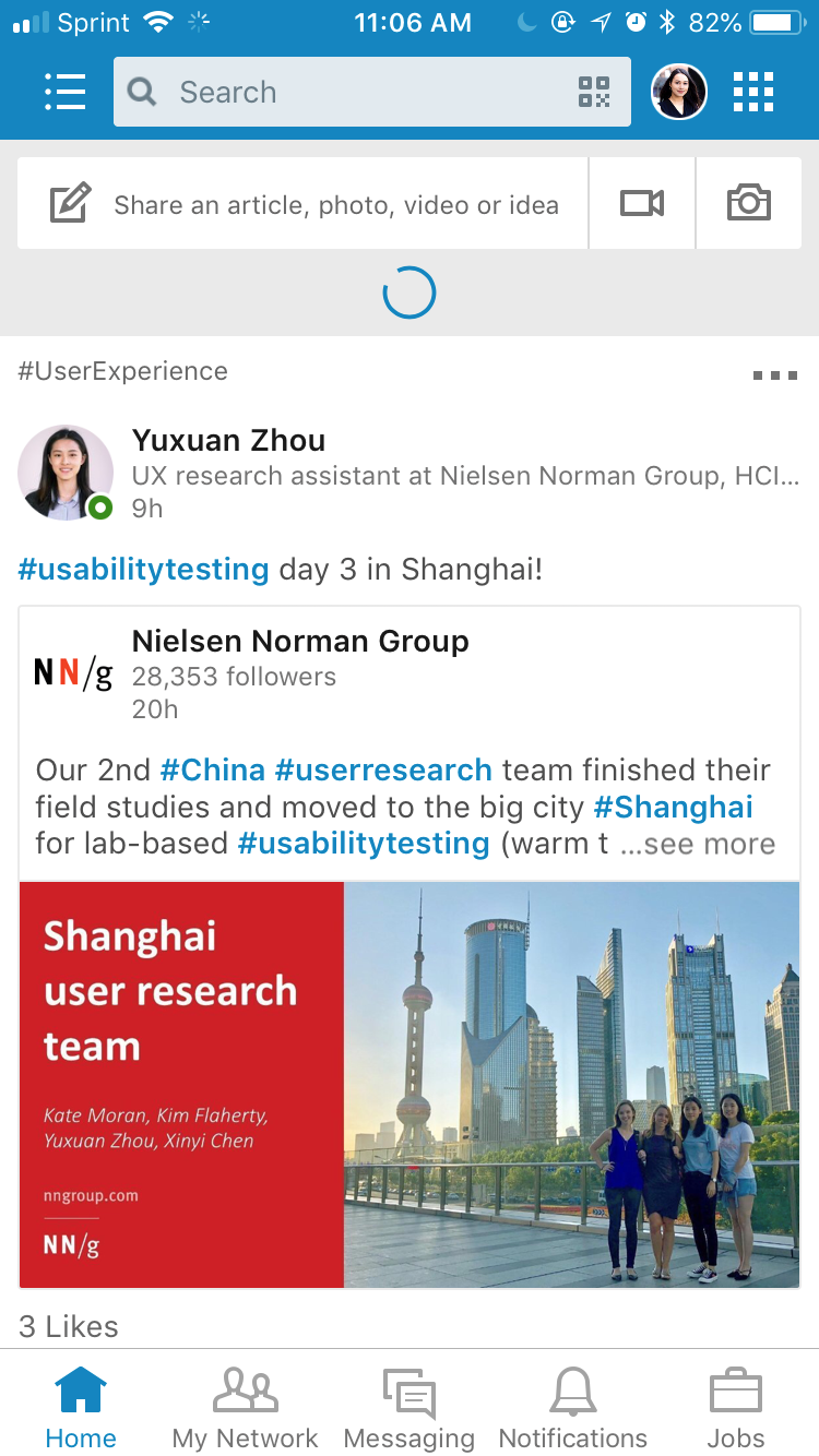
One of the crucial subcategories of micro-interaction; progress indicators are used by LinkedIn. As soon as the user pull-to-refresh their newsfeed, the system starts working so that the users don’t second-guess whether the system recognized their action.
Gap.com
Error prevention is another great feature that focuses on getting rid of error-prone situations and provide confirmation actions. Now there are times we click something by accident. During such a situation, systems should make it easy to undo actions so that users don’t have to jump through hoops to reverse something that they didn’t mean to do in the first place. Gap.com allows you to add items to your favorites by clicking a heart icon in the upper right-hand corner of the product image.
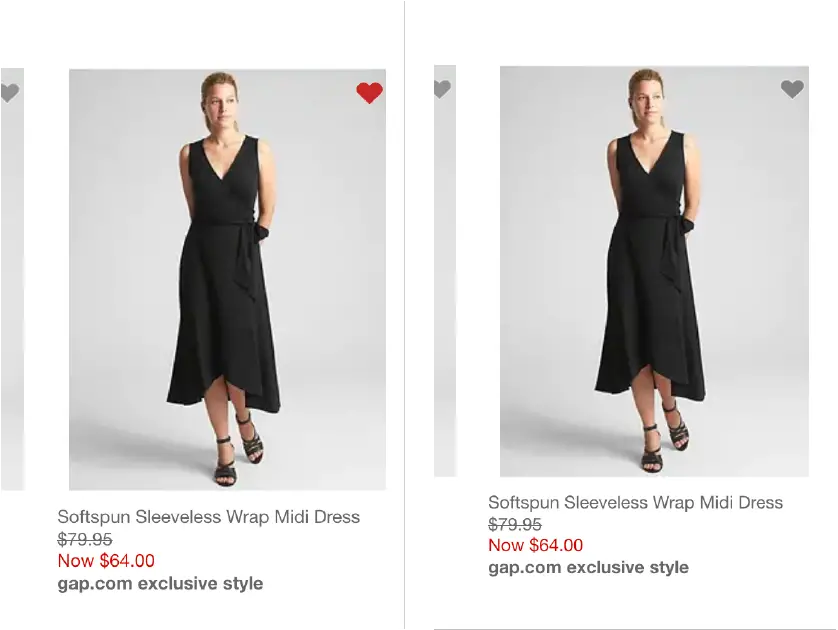
A pumping heart animation is used stating that you have favorite the product. You can easily undo this action by clicking again on the heart icon, which will then revert to its original grey state.
eBay
If you wish to look around for the best example of micro-interaction used in the registration form to prevent validation errors its eBay! For example, when the password field is active, a list of password requirements appears. As each of these requirements is met, the list updates dynamically. In case if the field is left without meeting any requirements, a red error message appears under the field.
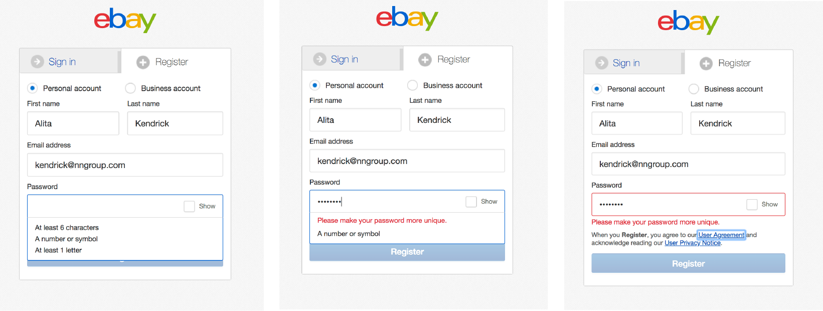
This series of micro-interactions work together to ensure users receive consistent feedback and have a smooth experience.
Conclusion
So, that’s all for now! All I would say that little details can transform a good product into a great product and disengaged user into an engaged user. Go for it!

