Table of Contents
Web design has recently grown to become one of the most important aspects of website development. This is because, with great web design, you’re able to create responsive apps and websites that provide great customer experience.
Bootstrap is an effective and powerful open-source tool that has turned out to be one of the most popular front-end frameworks in the world. This is thanks to the many Bootstrap templates available that make it easier to develop user interfaces. The tool was initially developed for Twitter before it became open source. It can be used by anyone who has basic knowledge in JavaScript, CSS, and HTML as it is easy to learn.
What makes it unique is its ability to create fully responsive, mobile-first, and well-functioning websites and apps without fuss. It’s hosted on Github and developed with Jekyll. It can be used to create Buttons, Tables, Forms, Dropdowns, and many other features that can be integrated into apps and websites using a single code base.
Before getting started with Bootstrap, here are a few things that you’ll need to do:
- Download Bootstrap from the official site.
- Extract its files.
- Search for three folders: viz. CSS, JavaScript, fonts. You can use these in any project.
- Begin coding on any preferred Editor/IDE.
- Some of the supported server-side languages include ASP.NET, PHP, and Ruby on Rails.
While using Bootstrap, developers have the liberty of solely concentrating on the building process without worrying about the website’s feel and look. The tool also comes with basic CSS and HTML templates which provide a firm foundation for developers when it comes to creating themes.
Below are 7 typical reasons why Bootstrap is ideal for responsive web design.
Easy Use
As mentioned earlier, Bootstrap comes with basic CSS and HTML templates to get developers started. It is easy to comprehend and use. Designers can use any editor or IDE to code. While at it, they can easily adapt any of the ready-made blocks of code depending on their needs. Not only does this make things easier but also makes sure that you save long hours of creating code.
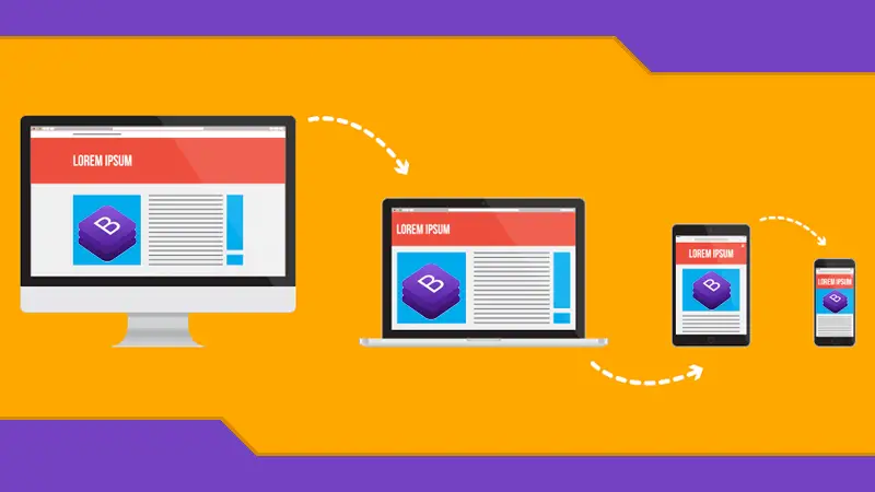
Responsive Grid System
Bootstrap has a grid-like layout that allows designers to have as much as 12 columns on a page. Flexible layouts can be achieved by manipulating any of the 4 classes available. This, however, depends on the device in use. The layout of a webpage is of utmost importance, especially, if it has to be viewed on both a mobile device and a desktop browser. Designers should ensure that it self-adjusts. The grid system in Bootstrap can help organize the elements of a webpage to make them fit well on any screen size.
Internal Consistency
At the very heart of Bootstrap is the goal to ensure that designers and developers achieve uniformity across different platforms. This was the core goal of developing the Bootstrap framework. Thanks to Bootstrap themes, the tool focuses on centralizing the development of code to make it easier for developers to achieve consistent results across all platforms. Regardless of who is taking care of the project, the output is the same. This also applies whether it’s done on Internet Explorer, Firefox, or Chrome. The ability to maintain this uniformity across various platforms, devices, and browsers, is what differentiates Bootstrap greatly from other frameworks.
Multiple Free Components
Bootstrap comes with multiple pre-styled components that make styling ever so easy. They are not complicated at all and make it easy to understand and use the tool altogether. All you need to do us tick off those that you do not require. Available Common CSS include code, typography, grid system, buttons, forms, tables, and print media styles. Components include button groups, labels, navbar, badges, button groups, pager, navs, and pagination. JavaScript components include popovers, tooltips, dropdowns, modals, and carousels. As for utilities, users get basic utilities and responsive utilities. These and many more components make it easy to craft ways of operating things on a webpage. Developers do not need to code from scratch while building a responsive site. There is an option of also buying pre-built templates that can be customized to one’s needs.
Great Support
Since Bootstrap is hosted on Github, users have access to a wide community of other users who offer ready support and news about regular updates. As of 2017, there were over 868 contributors and 16,475 commits. The number has grown greatly since then. Users also get access to a blog that houses multiple answers to frequently asked questions. It also offers solutions to any problems experienced. Bootstrap also accommodates developers who aren’t that well-versed with CSS and HTML, or those that are too lazy to dive into something new.
Speedy Development
One of the major benefits that Bootstrap users get to enjoy is its speed of development. If you would like to create a fresh and new application or website, Bootstrap is a great tool to utilize. Its cross-browser compatibility and CSS-Less functionality can be blended with the ready-made coding blocks to cut down the hours spent coding. To achieve the fastest potential route, consider buying ready-built Bootstrap themes that can be customized as desired.

Future Compatibility
The developers behind Bootstrap normally update the framework regularly to ensure that it’s always compatible with current and future needs. Every update takes into consideration the current and future state of web development as well as design. Developers are rest assured that they are always working with the most recent and most advanced tech.
Conclusion
With Bootstrap, you don’t have to reinvent the wheel each time you want to create a new application or website. This front-end framework is packed with multiple features that help developers accomplish their goals without starting from scratch. Templates and themes are built to be responsive from the word go, eliminating the worry of having a site that is not interactive. This allows developers to concentrate on what’s important, which is to build whatever it is that they have in mind.


“Designers are the only users who really care about design, everyone else want’s their pages to load fast.” Nonsense. Everyone wants good design AND their pages to load fast. I’d say that’s a part OF good design.